For the team
Brand kit
Logos, colour, type, photography, buttons and voice for PA Wedding Guide. Download what you need and build from it; check the guardrails at the bottom before anything goes out.
Logo
One lockup in two finishes, plus the icon tile. Logos sit on white or our very light pink and nowhere else: never on the signature pink, never on charcoal, never over a photo.
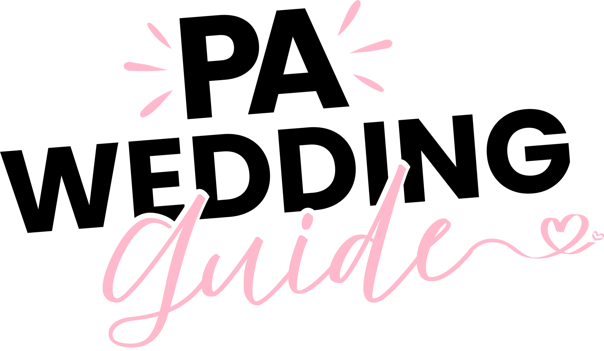
Primary
The lockup with a white keyline round the script. Use it by default: the site header, menus, documents, on white or the very light pink.
Download PNG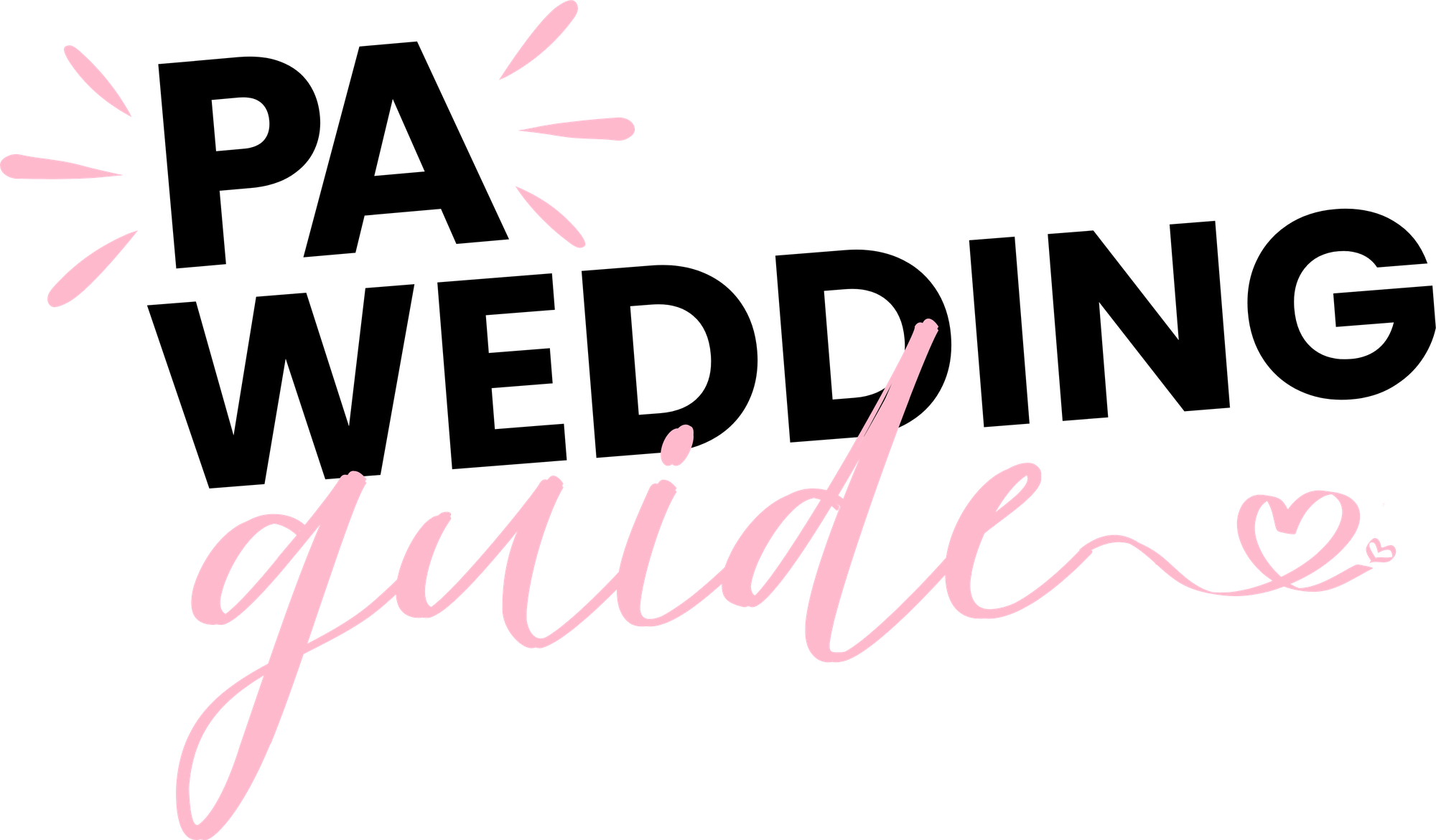
Secondary
The same lockup without the keyline, for the odd place the primary doesn't suit. White backgrounds only.
Download PNG
Do
- Use the primary (outlined) logo by default, on white or the very light pink #FFF1F5; keep the secondary for white
- Use the files exactly as supplied, at any size that keeps "Guide" readable
Don't
- Put any logo on the signature pink #FFB9CD, on charcoal, or over a photo
- Recolor, redraw, stretch or crop the lockup
Accents
Small hand-drawn pieces that add warmth around headlines and photos, plus the wave as a still graphic for social, print and email. All transparent, all in the signature pink.
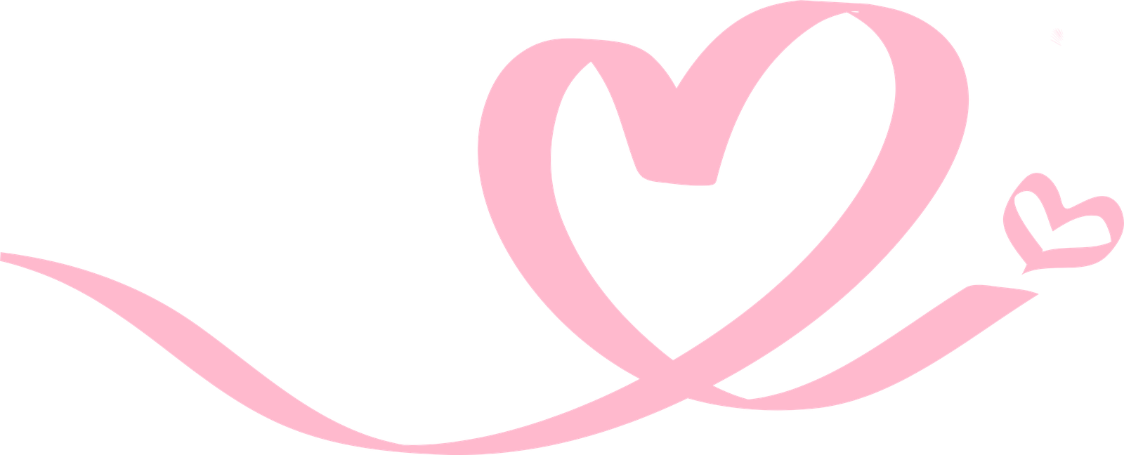



The wave, paused
Our moving wave caught mid-drift: a solid pink curve over a lighter 45% pink curve, offset so both show. Use it at the bottom edge of a graphic, the way the site uses it between sections.

Do
- Use one or two accents per layout, near a headline or a photo
- Keep them in the signature pink, as supplied
Don't
- Put text on an accent, or use one as a button or an icon
- Use the ribbon heart as a section break: that's the wave's job
Palette
Pink carries the brand, dark grey anchors structure and text, white gives everything room to breathe. Declared once in globals.css.
Signature Pink
#FFB9CD
The brand. Surfaces, badges, the pink button, focus rings. Never text.
Dark Grey
#333333
Text, nav, the default button, the footer.
White
#FFFFFF
Header bar, cards, inputs, room to breathe.
Light Pink
#FFF1F5
Soft sections, CTA bands, the foot of the hero.
Pink Sweep
#FFA0BB
The pink button's hover fill, and nothing else.
Darkest Grey
#1A1A1A
The dark button's hover fill.
Dashboard Grey
#FAFAFA
Internal dashboard shells.
Text Muted
#666666
Secondary text.
Border
#E5E7EB
Card borders and dividers.
Approved combinations
Only these pairings, measured against WCAG 2.1 AA (4.5 : 1 for body text). Pink is a background only.
Typography
Plus Jakarta Sans carries everything: headlines, subheads, body, forms. Weight does the work, so there is never a second family, and no script or cursive anywhere.
Display · 800
Plan your Pennsylvania wedding.
Heading · 600
Built around every PA county.
Body · 400
Browse real venues, photographers and vendors across every PA county. No generic national listings, just local pros who show up.
Aa
500 · Labels, nav
Aa
600 · Subheads
Aa
700 · Headlines
Aa
800 · Display
Voice and tone: Bridal Bestie Vibes
A friend who happens to know every good vendor in Pennsylvania: warm, a little excited for you, never stiff or salesy. Real opinions, no gatekeeping.
Encouraging, not gushing
Genuine enthusiasm, not exclamation-point spam. One "!" earns its place; the rest stay calm.
In the know
Speaks like she's been to these venues and met these vendors. Specific, never generic.
Down-to-earth glam
Elevated without being precious. Says "gorgeous," not "exquisite."
Zero gatekeeping
Shares the real info, prices, availability and advice, instead of "reach out to learn more."
Hero headline
Plan your dream Pennsylvania wedding without the guesswork.
Opening line
We started PA Wedding Guide because Pinterest boards don't book venues.
Category intro
Venues that don't need a filter. From Lancaster barns with string lights already hung to Philly rooftops with skyline views built in.
Section intro
What's actually happening in PA weddings right now. Real trends from real PA vendors: what couples are booking, what's selling out, and what to ask before you sign.
Do
- Write like you personally know the vendor or venue: specific details over generic praise
- Use contractions and "you" throughout
- Give real information: prices, counties, guest counts
Don't
- Stack exclamation points or use words like "exquisite," "unparalleled," "bespoke"
- Write generic copy that could describe any vendor, anywhere
- Hide information behind "contact us to learn more"
Photography
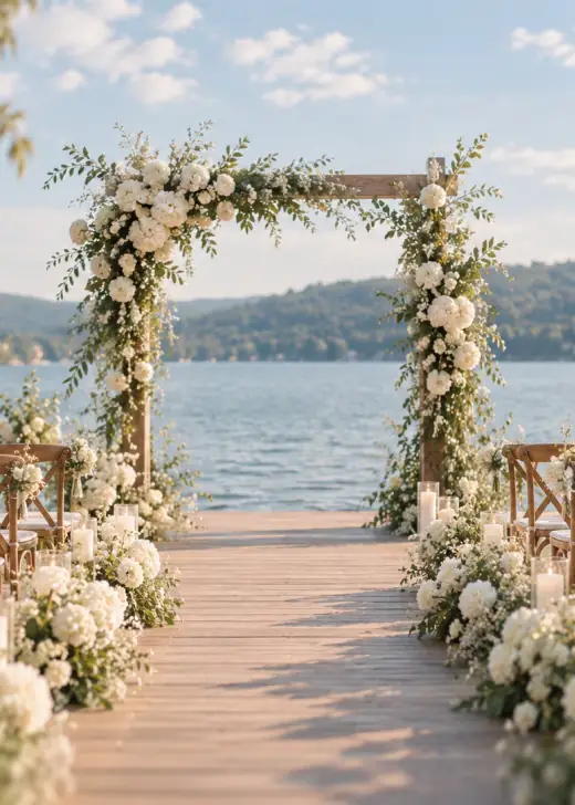
Every photo has rounded corners and sits at a slight tilt, like a print set down on a table. On white it needs nothing else; on pink or a darker background it gets a white border.
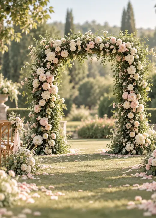
On white: rounded and tilted, no border.
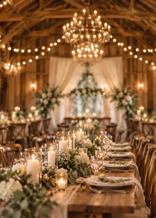
On pink or darker: the same, plus a white border.
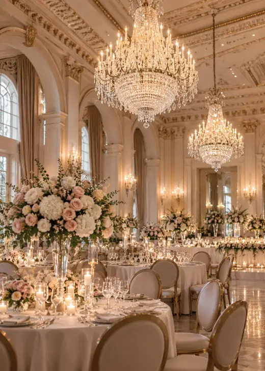
Lead with pink
Pink is the field, not the frame: the photo sits inset inside it like a Polaroid. Full-bleed photos work too, as long as pink shows up nearby, never as small text on top of the image.
Do
- Round every photo and tilt it a degree or two
- Add a white border when the photo sits on pink or a darker background
- Credit with a small 12px line on a dark grey gradient at the bottom, linked to the vendor's profile
Don't
- Use square corners, or a border on a plain white background
- Stamp a watermark or logo across a photo
- Set credit text or any small text in pink over a photo
Section breaks: the moving wave
When one full-width section hands over to another, a soft wave replaces the straight edge. This is the live component the site uses.
Do
- Color the wave like the section below it, so the two meet with no hard line
- Use it only where a full-width section changes color: hero to content, content to a pink band, a band to the footer
Don't
- Put a wave inside a card, a form or a pop-up, or between two sections of the same color
- Stack two waves at one seam
Buttons, links and motion
Two buttons only, both pills. On hover a slightly darker shade fills in from the left over 0.35s. Text links get a drawn pink underline, and every icon moves a little on hover.
Do
- Dark pill (#333333, white label) is the default; it fills with #1A1A1A
- Pink pill (#FFB9CD, dark label) is for accent actions; it fills with #FFA0BB
- Give every icon a small 3 to 4px nudge on hover in the direction it points
- Mark text links with the pink brush stroke under dark text
Don't
- Outline a button in a different color, or add a third button style
- Use a ruled line, a border or a plain browser underline on a link
- Spin, bounce or over-animate an icon
Content patterns
Quote cards for testimonials and reviews, and numbered steps for step-by-step flows.
We booked three vendors through PA Wedding Guide in one weekend. Every one of them showed up exactly like their profile said they would.
Megan R., Centre County
Being able to filter by county actually mattered. Our venue and caterer both needed to be within 20 minutes of Bellefonte.
Josh T., Clinton County
Best directory we've listed on. Real inquiries, not spam.
Ridley Creek Manor
Get in touch
Fill out our quick form and our partner team calls you within one business day.
Build your listing
We help you set up photos, services and pricing so couples see the real you.
Get found
Go live in your counties and start getting real inquiries.
Product UI: the vendor dashboard
The same brand, a little softer: white cards with gentle shadows on a faint pink wash, the signature pink for the active nav item and progress, and dark pills for the next action.
Setup guide
Finish your listing, one page at a time
Required to go live
3 of 4 done
Do
- Mark the active nav item with a signature pink pill, everything else plain
- Show the one next step as a dark pill with an arrow
- Tag status with soft chips: Done in light pink, Required in charcoal, Optional in light grey
- Set eyebrow labels in small dark grey capitals above the heading
- Outline must-do checklists with a dashed pink border
Don't
- Set eyebrows or labels in pink text
- Use more than one dark pill per card
- Use dark panels for whole sections of the dashboard
UI elements
How the palette and type come together in practice.
Badge
Venue · Centre CountyAnnouncement pill
New this weekCounty sticker
Listing card
Rosewood Barn
Lancaster, PA
Guardrails
Do
- Let pink lead: as the surface on bands, cards and pills, and as the accent on the light pink hero
- Keep dark grey #333333 for text and buttons, never pure black
- Keep type in Plus Jakarta Sans only
- Use only the supplied logos, icon tile and accents, exactly as supplied
- Round every photo, tilt it slightly, and border it in white on pink or dark backgrounds
Don't
- Bring tan, cream or beige tones into the palette
- Use serif or script fonts anywhere. The logo is the only script
- Set any text in pink
- Place a logo on the signature pink, on charcoal or over a photo
- Outline a button, or underline a link with a ruled line